Create visualizations and graphs
You can add an eye-catching chart to any query result set on the Explore. The Dashboard keeps query details and visualization configuration data together, so when you share a query, recipients get the picture as well as the data.
This topic explains how to create visualizations that best show off your data.
Before you begin
Step: Choose a Visualization Type
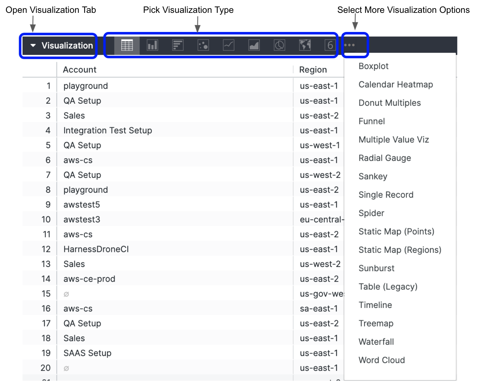
Once you’ve created and run your query, click the Visualization tab in the Explore to configure visualization options for the query. Use the chart buttons to pick the visualization type that’s right for the data.
- Create and run your query.
- Click the Visualization tab to start configuring your visualization options.
- Use the chart buttons to pick the visualization type that’s right for the data. For more information, see Visualization types.

Step: Fine-Tune Your Visualizations
You can customize a visualization to make the data more readable and to add visual styling, for example:
- Customize visualizations with chart settings
- Include multiple visualization types on a single chart
- Create stacked charts with multiple visualization types
Customize Visualizations with Chart Settings
To see the visualization options available for a particular visualization type, click that type on the Visualization types documentation page.
- In Visualization, click Edit. The edit options vary depending on the visualization type.
- Click the Plot tab. For details, see Visualization types.
Include Multiple Visualization Types on a Single Chart
You can also create charts that include more than one visualization type:
- In Visualization, click Edit. The edit options vary depending on the visualization type.
- Click the Series tab.
- In the Customizations section, you’ll see an entry for each series in the chart. Click the arrow next to the series you want to change to display its customization options.
- In the Type box, select the type of visualization to use for that series.
Charts with multiple series types always layer line and scatter series in front, then they layer area, column, and bar series.
You can alter the layering order of column, bar, and area series by changing the series’ positions in the data table and clicking the Run button. The leftmost series will layer on top and the rightmost series will layer on the bottom.
Create Stacked Charts with Multiple Visualization Types
You can include stacked series in a chart with multiple visualization types. All the series of the same type as the chart overall will be stacked together; series of other types will not stack.
- In Visualization, click Edit. The edit options vary depending on the visualization type.
- Click the Series tab.
- To create a stacked chart that uses multiple y-axes, drag any series to a different axis in the Y menu. The stacked series will appear together, but all other series can be moved independently. See Creating stacked charts.