Custom Widgets
Custom Widgets offer less predefined structure than Primary Widgets but offers more flexibility. When configuring Custom Widgets:
- First, you select a principal Harness entity that you want to analyze, such as, Deployments, Instances, Services, etc.
- Next, select a visualization type, such as a bar chart, line chart, etc.
- Finally configure details, including visual formatting, time range, groupings, and additional filters.
Before You Begin
Custom Widget Types
The following entities are available at the top level. Harness considers each to be a Custom Widget type:
- Deployments
- Instances
- Services
- Environments
- Workflows
- Pipelines
- Triggers
- Applications
- Cloud Providers
- Connectors
Visualization Types
If you're a non-Administrator, your access to the detailed data and settings behind the visualizations is filtered by your User Group memberships and permissions.Under each Custom Widget type, a row of buttons enables you to select a supported visualization type. You'll see some or all of these options, depending on which entity you're selecting:
| Donut Chart | Bar Chart | Line Chart | Area Chart | Aggregate Value |
 |  |  |  |  |
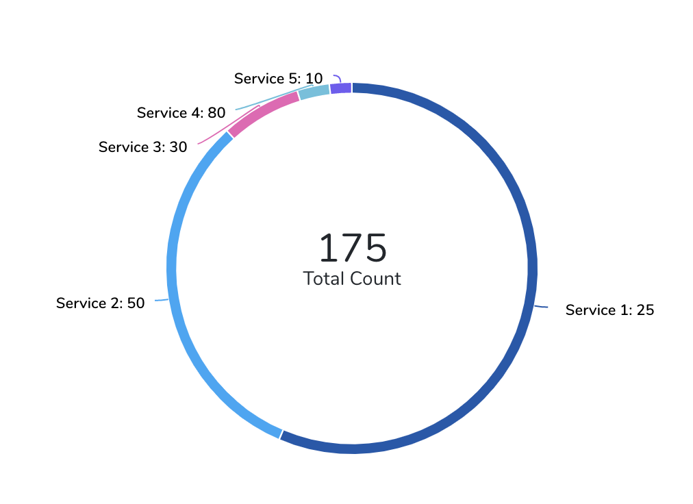
Donut Chart
When displaying Deployments as a donut chart, if you Group By a granular entity (such as Services, Environments, or Cloud Providers) or Tag, the displayed count can increase. This is because the display now includes the count for these entities or Tags.
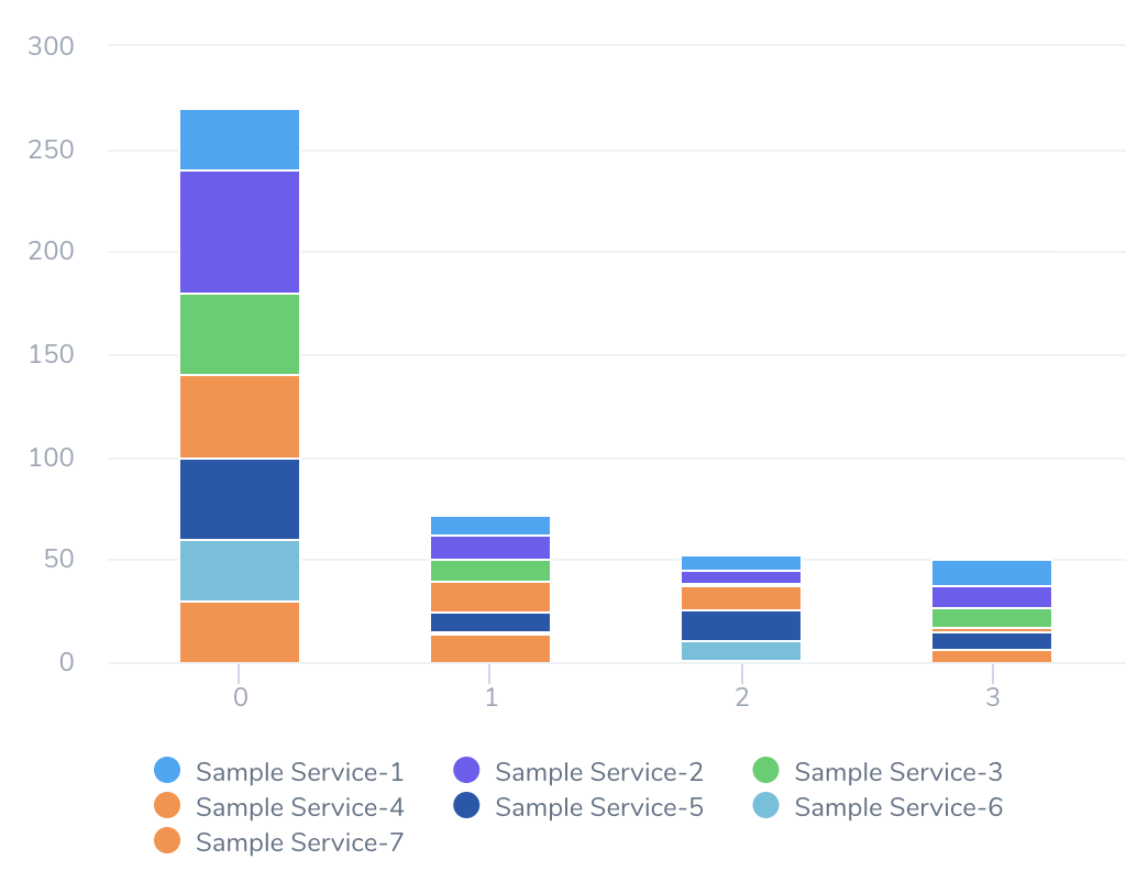
Bar Chart
Compared to a donut chart, a bar chart provides more ways to define and display your data. Using the added Second Group By option, you can display a time series, or you can plot an X/Y relationship among two entities or Tags.
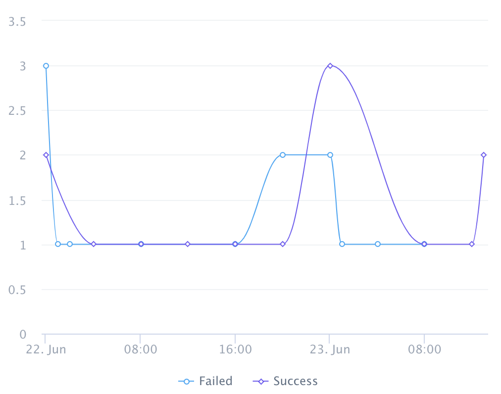
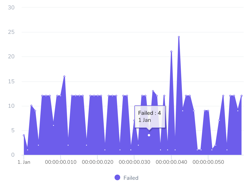
Line Chart and Area Chart
For this visualization type, the Second Group By setting must always be a time interval, building a time series. Use the Group By field to break down the displayed totals by any entity or Tag you want.
Area Chart
For this visualization type, the Second Group By setting must always be a time interval, building a time series. Use the Group By field to break down the displayed totals by any entity or Tag you want.
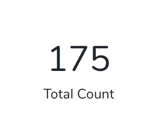
Aggregate Value
This visualization type (selectable with a "21” icon) simply displays a Total Count. It offers no Group By options and no clickable chart segments, but users can click its View Details link to pass through to the Harness Manager details aggregated in the total.