Add and Configure Custom Widgets
You can add Primary and Custom Widgets to your Custom Dashboards. Custom Widgets offer less predefined structure than Primary Widgets but offers more flexibility.
Before You Begin
- Custom Dashboards
- Primary Widgets
- Custom Widgets
- Filters, Groups, and Tags in Primary and Custom Widgets
Step: Add Custom Widgets
Ensure that you select entities that contain deployment data.
For example, if you select a Workflow with only Pre-deployment and Post-deployment steps but no deployment Phases, it will not have data on deploying a Service because no Service is used. Also, this Workflow might have an Environment in its setup, but that Environment won't be used because there is no deployment Phase. Hence, there will be no Environment data to display.
In such a case, the custom dashboard columns will be null.
To add Custom Widgets, perform the following steps:
Click Add Widget at the dashboard's upper right corner to populate or expand a Custom Dashboard. For more information, see Edit a Dashboard.
Select Custom Widgets.
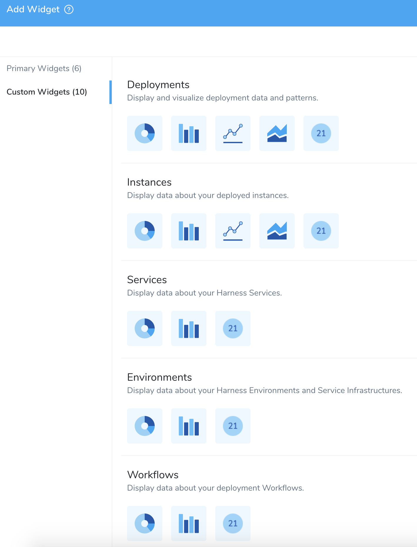
Select the Custom Widget Types.
Select a visualization type.
Step: Configure Deployments Widget
Deployments widget display and visualize your deployment data and patterns.
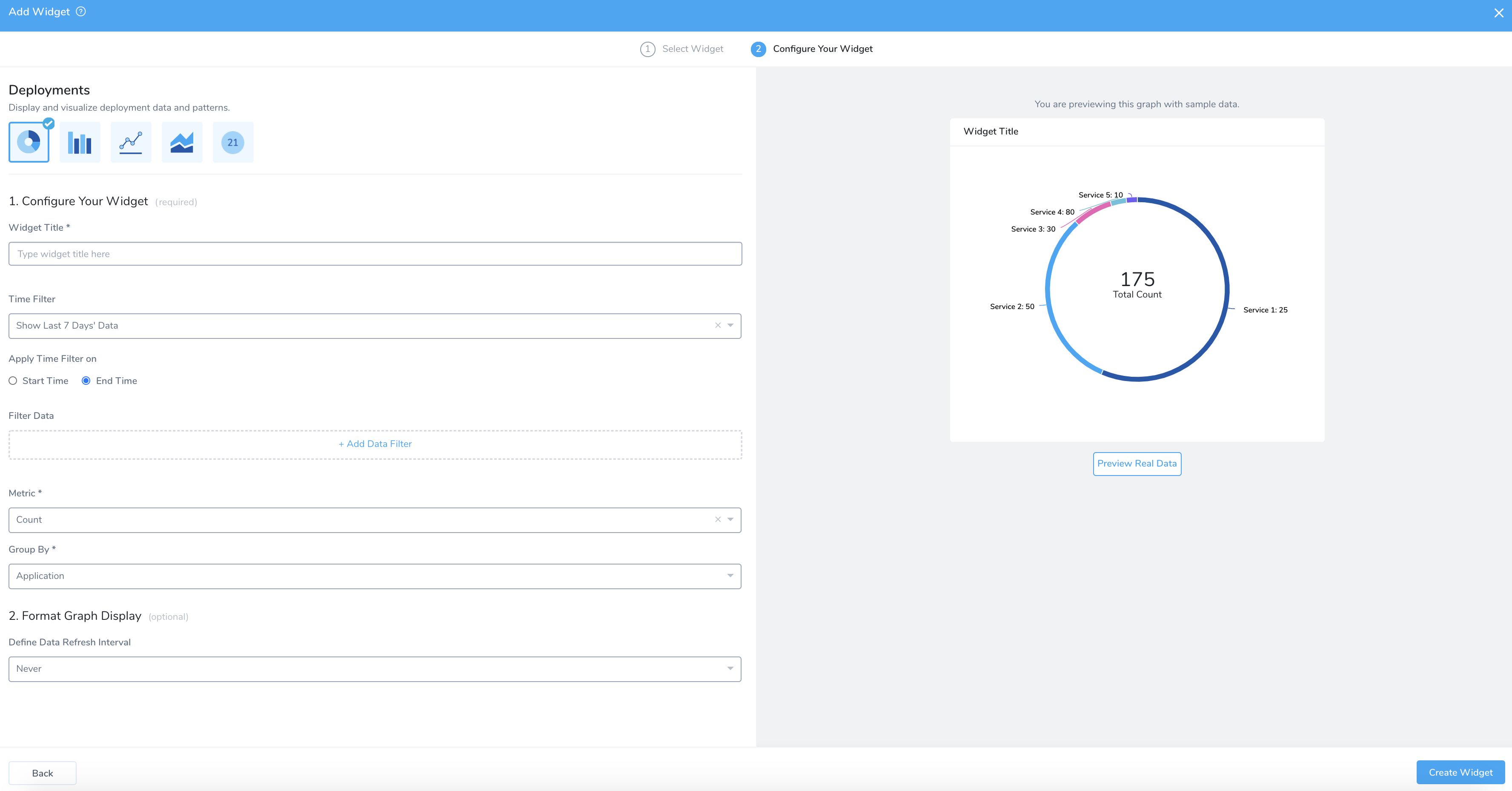
First, you need to Configure Your Widget (required) and then Format Graph Display (optional).
- The available options will vary depending on your Widget Type selection.
- This document uses Deployment Widget Type and Donut Visualization Type to demonstrate the steps required to configure the Widget.
Configure Your Widget
In Configure Your Widget, in Widget Title, enter a title for your widget.
- The widgets with the Time Filter option can now show data for up to a year.
- Currently, this feature is in Beta and behind a Feature Flag. Contact Harness Support to enable the feature. Feature Flags can only be removed for Harness Professional and Essentials editions. Once the feature is released to a general audience, it is available for Trial and Community Editions.
Select the Time Filter.
In Deployments and Instances Custom Widget type, for a bar chart, line chart, and area chart, you can select the following options in Time Filter:
- Show Last 1 Hour Data
- Show Last 24 Hours Data
- Show Last 7 Days Data
- Show Last 30 Days Data
- Show Last 6 Months Data
- Show Last 1 Year Data

In Apply Time Filter on, select Start Time or End Time.
If you select Start Time, then you will have two additional intermediate Status, Running and Paused.

In Filter Data, Add Data Filter. For more information on filters, see Filters, Groups, and Tags.
In Select Filter Type, select the filter. You can select:
- Application
- Service
- Environment
- Environment Type
- Cloud Providers
- Status
- Tag (Application)
- Tag (Service)
- Tag (Environment)
- Tag (Deployment).
Filter values are listed based on your Filter type selection.
You can add up to nine data filters.
Tags
Ensure you are familiar with Harness Tags and using variables expressions in Tag names and values. See Use Expressions in Workflow and Pipeline Tags.
This can be a very powerful method for creating Custom Dashboards. For example, let's say you had a Workflow or Pipeline Tag named commitID. The value for it is passed in as an expression, such as ${workflow.variables.commitID}. You could provide the value for the variable using a Trigger that passes in a Git commit ID.
When you deploy, the expression is evaluated and the commit ID is displayed in Deployments like commitID:521747298a3790fde1710f3aa2d03b55020575aa.
Now, you can create a Custom Dashboard for the name commitID that filters or groups deployments by each commit ID.
- You can create a Harness Custom Dashboard that filters or groups using Tags that use expressions.
- You can use a Tag whose name or value uses an expression, but you can only filter or group by Tag name.
- You cannot use the expression itself to filter or group. You must use the evaluated expression displayed in Harness Deployments.
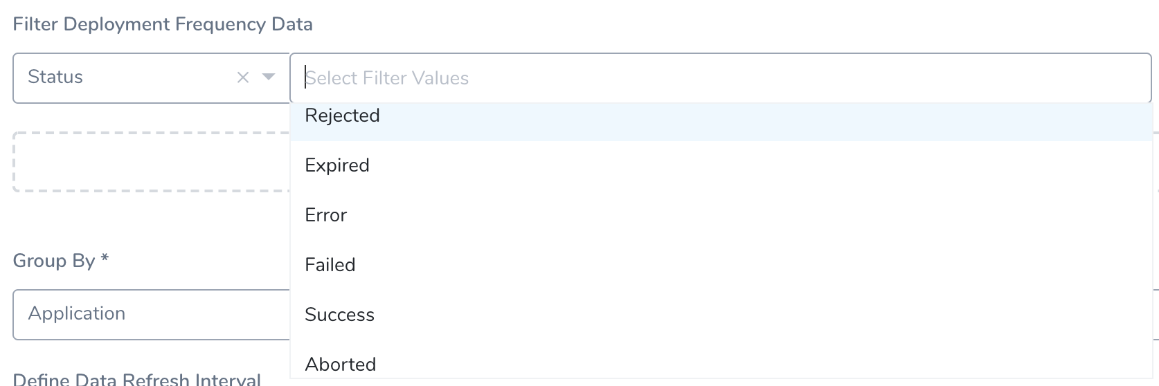
Status
For Status the following terminal statuses are available:
Rejected: Filters the rejected deployments.
Expired: Filters the expired deployments.
Error: Filters the deployments with errors. This status filters the deployments with unforeseen circumstances, for example, delegate not available, corrupted data, etc.
Failed: Filters the failed deployments. This status filters the deployments that might have failed because of health check or configuration issues.
Success: Filters the successful deployments.
Aborted: Filters the aborted deployments.
In Metric, select Count, Time Taken, or Rollback Time Taken.

In Group By select, Group by Entity or Group by Tag.
Group by Entity: Select Application, Environment, Environment Type, Service, Status, or Cloud Provider.

Group by Tag: Select Tag (in Application), Tag (in Service), Tag (in Environment), or Tag (in Deployment).

Select the Tag Name.

You can use the added Second Group By option for Bar Chart, Line Chart and Area Chart to display a time series, or you can plot an X/Y relationship among two entities or Tags.
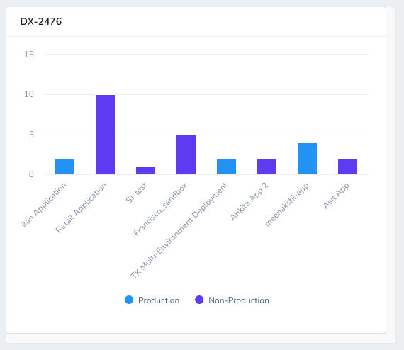
For example, if you selected Filter Data: Environment Type: Production, Non-Production and Group By: Application you will see each Applications for Production and Non-Production Environments, but they are separated by Environment Type:
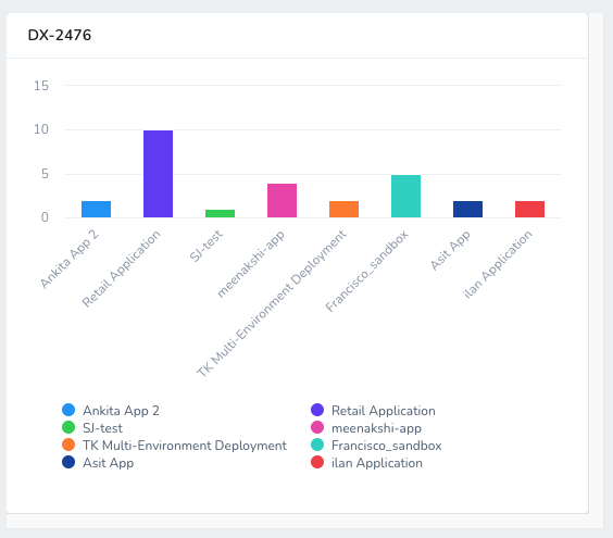
If you select Second Group By: Environment Type, you can see the same Applications grouped by Environment Type:
Format Graph Display
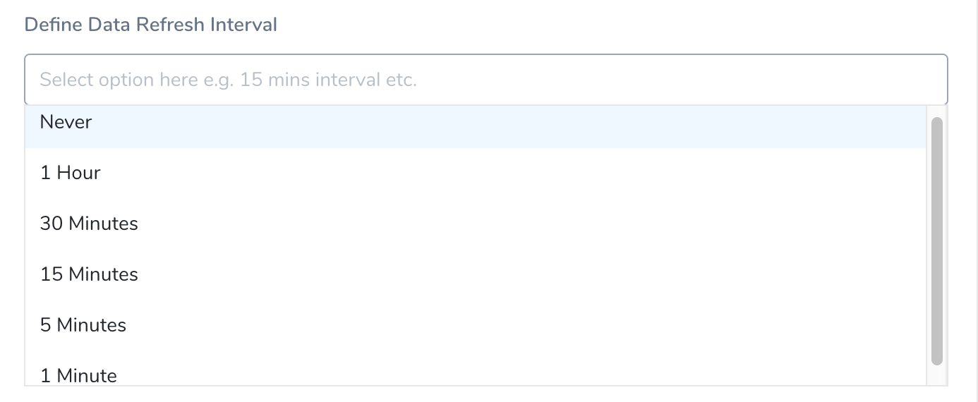
In Define Data Refresh Interval, select the interval. The default value of Define Data Refresh Interval is Never.
Once you have configured the Widget, click Create Widget.
Step: Configure Applications Widget
The Applications widget displays data about your Harness Applications.
Configure Your Widget
In Widget Title, enter a title for your widget.
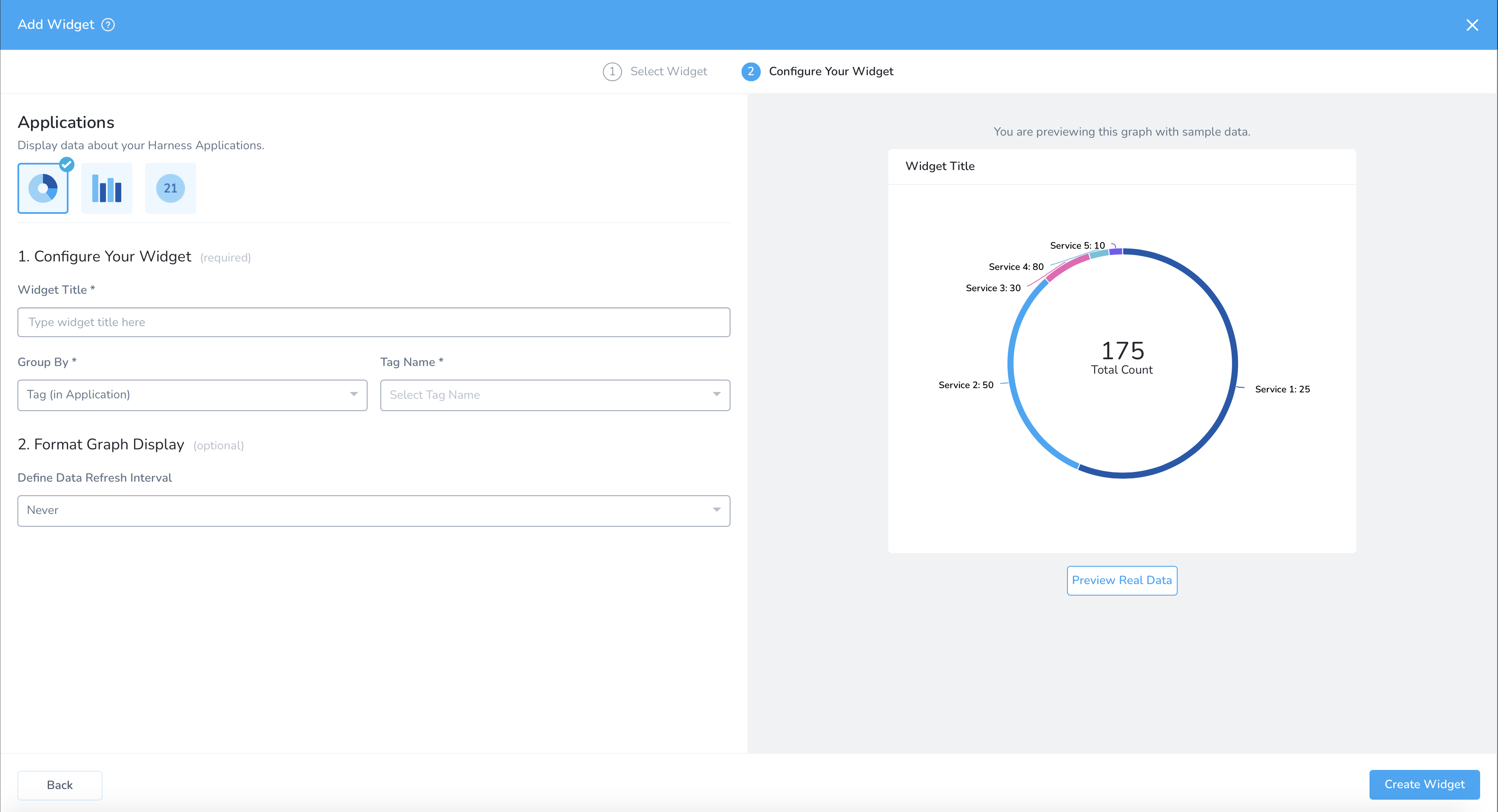
In Group By, select Tag (in Application). For more information on tags, see Manage Tags.
Tag (in Application) is available for Donut and Bar Chart visualization types only.

In Tag Name, select the name of the tag.

Format Graph Display
In Define Data Refresh Interval, select the interval. The default value is Never.

Once you have configured the Widget, click Create Widget.
Step: Configure Services Widget
The Services widget displays data about your Harness Services.
For example, you can filter by the Service deployment type:

This filter will display all of the Harness Services by deployment type (this also uses Second Group By: Deployment Type):

Clicking any of the bars will drill down to show the deployments of that type.
Step: Configure Workflows Widget
This widget displays data about your deployment Workflows.
For example, you can filter by Workflow Type (strategy used by a Workflow):

This filter will display all of the Harness Workflow by Workflow type (this also uses Second Group By: Workflow Type):

View/Edit Widgets
Account Administrators can edit the existing Widgets.
Click Widget's More Options •••.

Select View/**Edit**. This reopens controls for Add Primary Widgets. You can follow the Add Primary Widgets steps to edit the configurations.
- Once you have configured the Widget, click Update Widget.
Remove Widgets
Account Administrators can Remove the existing Widgets. Remove deletes the Widget from this Custom Dashboard.
If you've customized the Widget's configuration, this also removes that configuration from your Harness account. This action cannot be undone. Consider first cloning a backup copy of the current dashboard.
In Widget, click More Options •••.

Select Remove.
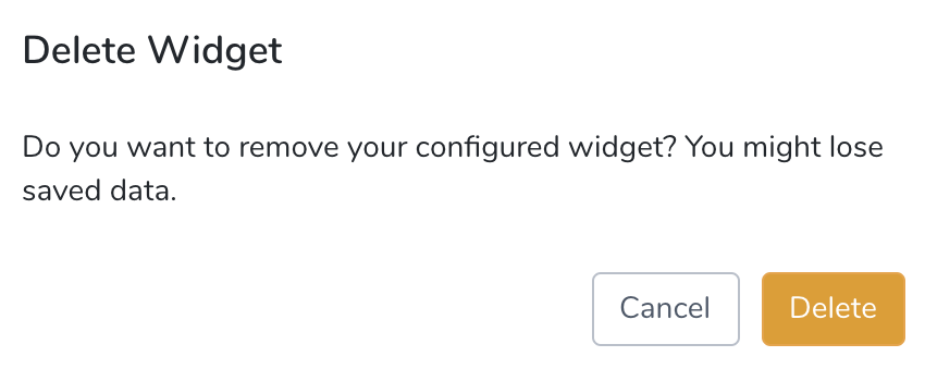
Click Delete to remove the Widget.